Good decision making is key to business success and good decisions need the best data. So it’s little surprise that many businesses today are investing heavily in sophisticated BI tools and whole departments dedicated to analyzing their data and visualizing KPIs.
Typically, those tools take the form of query-based reporting or dashboards set up to track the most important, high-level dimensions and metrics. While those tools are great for seeing trends or going fishing for something specific, they’re also extremely high maintenance. Without ongoing time and effort (usually from multiple teams), they tend to become defunct.
At their best, BI dashboards save the time and effort you'd otherwise have to put into collecting and mish-mashing different reports together. But even at their best, those tools have extremely limited detection and alerting capabilities and absolutely no ability to apply corrections.
Dashboard Reporting and Visualization Fall Short
If you work on the revenue side of a publisher, you probably have a love-hate relationship with your data tools. Your work wouldn’t be possible without them, but using them is often a pain in the a** and they have diminishing marginal returns.
Usually by the time you find what you're after, the facts on the ground have already changed. The feature set rarely matches up cleanly with your actual needs and badly needed updates never seem to come soon enough.
The gold standard for a good reporting system is accurately aggregating all the data you need in one place. That’s awesome, but it's still a huge hassle to work through all that data.
Reporting suites give you access to (a limited number of) key metrics and dimensions so that you can keep an eye on the most common and important issues — letting you know where deeper investigations might be needed.

In an ideal world, you’d have time to properly and proactively monitor your reports. In real life though, you’re probably spending hours every day just setting up and skimming scattershot reports as you find and fight (often fake) issues.
Being able to monitor a set of key reports is great, but it’s not enough.
Issues still fall through the cracks — either because they’re not occurring in the expected places or are hiding at a level of granularity your reports can’t cover. This creates huge blind spots that contribute to real revenue losses.
Even when issues happen to occur in the places that you know to look at, you still need time to dive in — disentangling all related impact points, figuring out the root cause, and identifying the most effective intervention. But who really has that time?
Visualization tools can definitely help speed things up, but they’re still subject to the same basic flaws, i.e. they only provide high-level oversight of the places you would think to look.
Sure, you could try to configure multiple dashboards & reports for all possible metric & dimension combos... but honestly, who has the resources to create and regularly review all that?
The fact is that the value of reporting and visualization tools comes from their ability to aggregate and present data in ways that should make it quicker for you — a human — to review.
But that means that you still need to slowly and painstakingly investigate and interpret that data all on your own — not to mention solve the issue — which creates bottlenecks and severely hampers overall productivity.
The Costs Involved
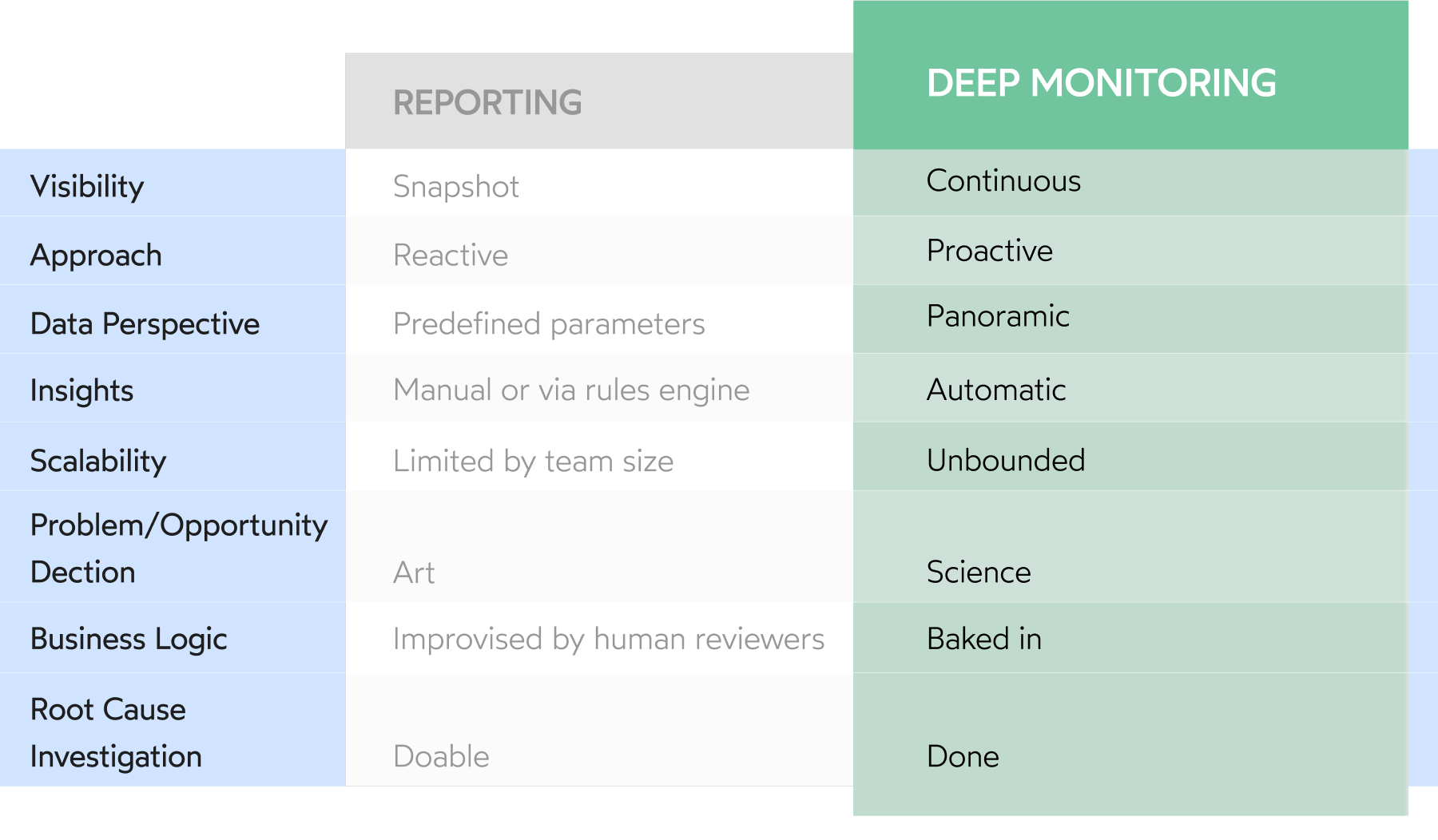
Clearly, there's a lot separating reporting and visualization tools from any type of panoramic monitoring system that's truly deep and efficient. But does that really matter?

It really, really does.
According to oolo’s 2021 State of AdOps report, publisher ad and revenue professionals lose over 3 hours per day manually reviewing data . That’s time that could have been put toward strategic planning and other important tasks.
The same report from the year prior found that 82% of dashboard-dependent digital publishers miss critical issues every week !
But even when issues aren’t missed, they still wait on someone (maybe multiple someones) to investigate and fix them.
Whether owing to blindspot or a bottleneck, the result is the same: lost revenue.
Based on oolo’s numbers and case studies, these routine inefficiencies have a bottom-line impact of 6-15% .
Thinking Beyond Dashboards & Reports
Even as publishers recognize they're incurring preventable losses due to reporting and dashboard shortcomings, little has changed. In fact, according to oolo’s 2021 State of AdOps report, only 23% of publishers are even aiming for monitoring automation.
But with only dashboards and reports to rely on, it’s just not possible to continuously health-check huge and growing amounts of data points, while accounting for seasonality, historical performance, external factors, dev errors, and normal variance.
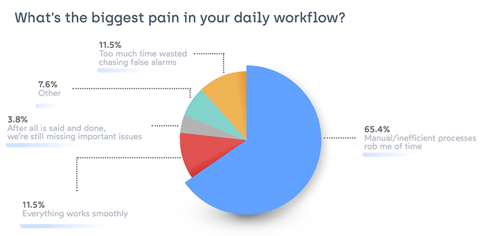
That's why 65% of publishers consider time lost to manual or inefficient processes their biggest daily pain.

The fact is publishers need more reliable, more real-time technologies to help them detect and correct problems affecting their monetization.
A true 360° deep monitoring system is needed. A system that does the heavy analysis lifting for you — not just working through data mountains to find the interesting incidents, but also:
- Separating out real issues from normal fluctuations
- Identifying the root cause
- Assessing the revenue impact
- Suggesting actionable solutions
A system of this sort would save time, money, and frustration by removing bottlenecks and oversights. It would also add value by surfacing problems and opportunities in real time and automatically documenting incidents.
While the current reality for most publishers doesn't approach this type of monitoring, that doesn't mean it's out of reach. To learn how it can be achieved, check out The 4 Things Publishers Need for Smart, Proactive Data Monitoring.


